
A fine piece of jewelry can disappear in a flat photograph. A beautifully formulated skincare product can look ordinary under harsh overhead light. That is why a luxury product photography guide starts with a simple principle: the image must make the product feel as considered as the product itself. Every choice, from a reflective surface to the angle of a highlight, shapes what customers believe about your brand before they read a word of copy.
For New York-area businesses, makers, jewelers, and premium consumer brands, product photography is not merely documentation. It is visual positioning. High-end images create the confidence to command attention in a crowded feed, support a higher perceived value, and give your website, campaign, press materials, and social content a consistent editorial point of view.
Start With the Feeling You Want to Sell
Luxury is not one visual style. A fragrance bottle might call for shadowy, cinematic light and rich texture. A modern jewelry collection may need clean lines, crisp reflections, and a quiet palette. A wellness brand may benefit from luminous daylight, organic materials, and room for the product to breathe.
Before a shoot, define the feeling your audience should have when they see the finished image. Is it refined and understated, playful and fashion-forward, heritage-driven, sensorial, or architectural? This decision informs the set, color palette, lighting direction, crop, props, and retouching. Without it, even technically correct photos can feel disconnected from the brand.
A useful creative brief identifies the intended customer, where the images will appear, and the details that make the product special. Note material finishes, signature colors, packaging details, seasonal campaign needs, and any required negative space for text. Bring examples for mood rather than asking to duplicate another brand’s work. The goal is to establish a visual language that is recognizably yours.
Build a Shot List That Works Beyond One Post
A single hero image rarely carries a launch. Premium brands need a small, flexible collection that can work across e-commerce, social media, paid advertising, print, retailer submissions, and editorial outreach. Planning those uses in advance avoids a beautiful gallery that is difficult to crop or repurpose.
Your shot list should include the essential product angles, detail images, packaging, and scale references where relevant. Then add the images that create desire: a dramatic hero composition, a tactile close-up, product grouped with complementary items, and a few vertical or wide frames with intentional room for copy.
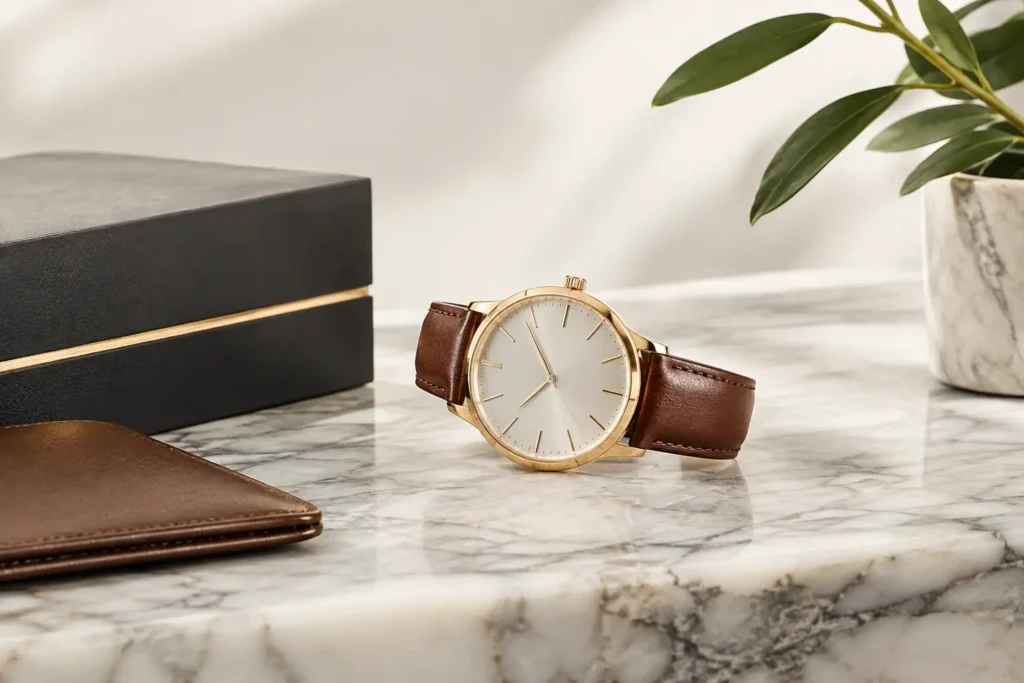
For items such as watches, rings, cosmetics, handbags, or bottled goods, details are often where quality becomes visible. Fine engraving, stitching, texture, clasp construction, foil stamping, and the way a formula catches the light are not minor details. They are proof points. Photograph them with enough precision that a customer can sense craftsmanship without holding the item.
Lighting Is Where Luxury Takes Shape
Expensive-looking product photography is not necessarily bright or complicated. It is controlled. Light should reveal the form, finish, and color of an object while protecting its most challenging surfaces.
Soft, directional lighting can make leather feel rich, show the curve of glass, and create a flattering sheen on skincare packaging. Harder light may be exactly right for a bold fashion accessory or a graphic campaign concept. The question is whether the light supports the product’s personality, not whether it follows a trend.
Reflective materials require particular patience. Jewelry, chrome, glass, glossy packaging, and polished metal can reflect the camera, studio, hands, and every unwanted object nearby. This is where careful flagging, diffusers, controlled reflections, and precise camera placement matter. Retouching can refine a final frame, but it cannot replace thoughtful lighting on set.
Color accuracy matters just as much. If a lipstick shade, gemstone, fabric, or label color shifts from image to image, customers may hesitate. A professional workflow uses consistent lighting and calibrated editing so the product feels trustworthy across a complete campaign.
Style With Intention, Not Clutter
Props can make an image feel editorial, but they can also make a premium product look like an afterthought. Every surface, fabric, botanical element, background, and styling object should have a reason to be in the frame.
Start by asking what world the product belongs in. A handcrafted candle may suit stone, linen, or warm wood. A luxury tech accessory may look stronger against sculptural paper, acrylic, or a restrained architectural background. A clean beauty line may call for ingredients that hint at the formula, provided they are genuine to the brand and do not overpower the packaging.
Minimalism is often effective, but it is not automatically luxurious. An empty white background can be ideal for a product page, yet it may not tell enough of a story for a campaign. Conversely, a more layered set can add dimension and emotion but may date quickly or create awkward crops. The strongest approach usually combines both: clear, consistent catalog-style images alongside more expressive editorial frames.
Let Composition Direct the Eye
Luxury photography gives the viewer a clear place to look. The product should feel intentional within the frame, whether centered with graphic symmetry or placed off-center in a more dynamic composition.
Pay close attention to spacing around logos and labels. Packaging typography must remain legible, but it should not be flattened by direct glare or distorted by an unflattering angle. Consider the shape of the platform, too. A vertical story crop needs a different composition than a wide homepage banner. Capturing both during the session is far more efficient than trying to force one image into every format afterward.
Scale can be another important consideration. Some products need a hand, a model, or an environmental element to show size and create a human connection. Others benefit from isolation, especially when the design itself is the statement. It depends on what customers need to understand before purchasing.
Retouching Should Look Refined, Not Artificial
Premium retouching is precise and restrained. It removes dust, small scratches, fingerprints, distracting reflections, uneven background tones, and minor packaging imperfections while preserving the believable character of the item.
Over-retouching can make materials look plastic, erase texture, or create a finish that customers will not recognize when the product arrives. This is especially risky with food, textiles, handmade goods, and natural skincare. The image should feel elevated, not misleading.
Consistency also matters across the full set. Whites should match. Shadows should feel related. Metallic finishes should retain their natural tone. When a customer scrolls through a collection or opens a product page, the imagery should feel like it came from one thoughtful visual world.
Plan for People When the Brand Needs Presence
Some products become more compelling when shown in use. A handbag changes when it moves with a model. Jewelry gains scale and feeling on skin. Beauty products can convey texture, ritual, and aspiration through hands, faces, and gestures.
The challenge is keeping the product central without making the talent feel stiff or secondary. Direction should be simple and confident, with attention to posture, hand placement, and the small movements that make a campaign feel natural. A model does not need to stare at the camera for the image to feel engaging. Often, a candid gesture or quiet moment creates a more authentic connection.
For brands in the New York metro area, a tailored shoot can combine clean e-commerce essentials with fashion-led lifestyle imagery in one carefully planned session. Michaels Photography brings a creative, editorial eye to that process, helping clients shape a concept, manage lighting details, and create polished images that feel true to the product and the people it is made for.
Give the Shoot Enough Time to Be Precise
The most common mistake in product photography is underestimating setup time. A simple-looking image may require several rounds of lighting adjustments, styling refinements, surface cleaning, and tiny changes in product position. That care is not slow for the sake of it. It is what separates an image that is merely usable from one that feels agency-ready.
Arrive with clean products, backup packaging where possible, and all variations you want photographed. Confirm final logos, labels, and colorways before the shoot. If an item has a difficult surface or delicate construction, share that early so the setup can be designed around it.
The best final images make the work look effortless. Behind them is a clear creative idea, patient technical control, and respect for the details your customers will notice. Give your product the same level of attention that went into making it, and the photograph can carry that value into every first impression.