
A beautifully made product can still look ordinary when it is photographed without intention. Product photo styling is what gives an image its point of view: the surface beneath a bottle, the fold of fabric beside a piece of jewelry, the color palette that makes packaging feel instantly recognizable. It helps customers understand not only what they are buying, but why it belongs in their life.
For a growing brand, those visual choices are not decoration. They shape perceived value, establish consistency across campaigns, and give a product the editorial presence needed to compete in a crowded feed, marketplace, catalog, or print ad. The strongest styling feels effortless, but every element has a job.
Start With the Feeling Your Product Should Create
Before selecting props or building a set, define the reaction the image should create. A skin-care line may need to feel clean, calm, and clinical without becoming cold. A handmade candle may call for warmth, texture, and a sense of ritual. Fine jewelry often needs precision and restraint, while a playful food or beverage brand may benefit from bolder color and movement.
This is where styling becomes more than arranging attractive objects. The product, audience, price point, and intended placement all influence the creative direction. A polished hero image for a luxury campaign should not necessarily look like a casual social post, even if both feature the same item.
A helpful early question is: what should someone assume about this product within two seconds? Premium, practical, fresh, indulgent, sustainable, fashion-forward, giftable, or approachable are all different visual territories. Once that answer is clear, the styling decisions become easier and more consistent.
Build a Product Photo Styling Direction Before the Shoot
Good results begin well before the camera comes out. A styling direction gives the shoot a visual framework, so every frame supports the same brand story rather than looking like a collection of unrelated ideas.
Begin with the product itself. Notice its dominant colors, finish, scale, shape, and most important details. A matte ceramic vessel behaves differently in light than a reflective perfume bottle. A small ring may need a minimal set that preserves its scale, while a large home product may need an environment that shows how it lives in a real space.
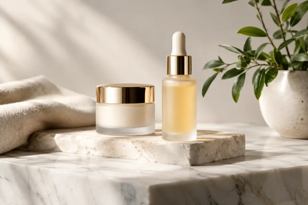
Then consider the visual world around it. The background, surfaces, props, wardrobe, and even the type of shadow should feel connected. For example, a natural wellness product might work with stone, linen, soft daylight, and restrained botanical accents. That same approach could make a high-shine cosmetic item feel underpowered, where mirrored surfaces, saturated color, or dramatic light may better communicate energy and glamour.
Reference images can be useful, but they should guide the mood rather than be copied. The goal is to create a recognizable visual identity that is genuinely yours. A creative, editorial eye can bring fresh ideas to the set while keeping the work grounded in what your customer needs to see.
Let the product remain the hero
The most common styling mistake is giving props more personality than the item being sold. A compelling set can create context, but it should not force the viewer to search for the product. If an image looks lovely with the product removed, the styling may be doing too much.
Use props to clarify use, ingredients, season, texture, or lifestyle. A tea brand might include a ceramic cup and a loose scatter of leaves. A handbag may be paired with a coat, a book, or a beautifully considered tabletop moment. Keep those supporting pieces subordinate in scale, contrast, and focus.
Negative space is equally valuable. It gives packaging room to breathe, directs the eye, and can leave practical space for ad copy or a social graphic. Not every image needs a fully built scene.
Choose Surfaces and Props With Purpose
A surface changes the entire message of a product. Marble can suggest luxury or clean beauty, but it can also feel overused if it does not fit the brand. Wood can add warmth and craft, while acrylic, metal, and colored paper can create a more contemporary studio look. Fabric introduces softness, though its wrinkles and texture need to be carefully controlled.
Props should add information rather than visual noise. For food products, ingredients can communicate flavor and freshness. For beauty products, water, botanicals, towels, or glassware can help establish ritual. For jewelry, a carefully selected pedestal or textile can introduce depth without distracting from the craftsmanship.
Color deserves the same level of thought. A monochromatic set can feel elevated and focused, particularly when the product packaging is strong. Complementary colors create more energy and contrast. Neutral tones are versatile, but they still need to be chosen carefully: warm cream, cool gray, soft blush, and crisp white all tell a different story.
There is a trade-off here. More styling can make an image memorable, but simple product photography is often more useful for e-commerce listings, wholesale materials, and product detail pages. A smart shot list includes both. Clean, accurate images build confidence, while styled campaign images create desire.
Lighting Is Part of the Styling
Styling does not end with objects on set. Light determines whether those objects look expensive, dimensional, and believable. It reveals texture on a leather accessory, creates sparkle in a gemstone, defines the contours of a glass bottle, and prevents a white package from disappearing into a white background.
Soft light is often flattering for products with matte finishes, skin-care packaging, textiles, and lifestyle scenes. It can create a calm, refined atmosphere with gentle shadows. More directional light can bring drama to a fragrance bottle, a fashion accessory, or a beverage image where highlights and shadow shape are part of the visual appeal.
Reflective items require extra care. Jewelry, glass, chrome, and glossy packaging can pick up unwanted reflections from the room, equipment, or even the photographer. Professional lighting control is what keeps those surfaces clean while preserving the highlights that make them feel polished.
The background needs its own lighting consideration as well. A background that is too bright can flatten the product. One that is too dark may hide essential detail. The right balance depends on where the images will appear and how the brand wants to be perceived.
Style for Every Place the Images Will Be Used
A campaign image is not always composed the same way as a website banner, an online store listing, or an Instagram post. Planning for usage upfront saves time and protects the quality of the final asset library.
Vertical images often work well for stories, reels covers, and mobile-first advertising. Horizontal frames can support website headers, lookbooks, and email banners. Square crops remain useful for marketplaces and grid-based social content. When the product is placed near the edge of a frame, leave enough room that key details will survive different crops.
It also helps to photograph a range of compositions during the same styling setup. A wide scene establishes the mood. A mid-range image shows the product in context. Close-ups capture texture, labels, closures, ingredients, or the craftsmanship that helps justify a premium price. Those variations let a brand use one cohesive shoot across many touchpoints without repeating the same image.
For New York-area businesses preparing a launch, seasonal campaign, or agency presentation, this kind of planning matters. Michaels Photography approaches commercial sessions with a high-end finish and hands-on creative direction, helping products look considered from the first concept through the final edited gallery.
Know When to Keep It Simple
Some products need an elaborate set. Others need a clean background, precise lighting, and nothing else. The right choice depends on the sales goal.
If a customer must compare color, size, material, or product features, clarity comes first. Accurate color and detail are nonnegotiable. If the goal is to introduce a new collection or build emotional connection, a more stylized scene can give the product atmosphere and aspiration.
The best product photography usually combines both approaches. A clear product-on-white image answers practical questions. A styled image gives the product a place in the customer’s imagination. Together, they make a stronger case than either can make alone.
Small details change the final image
A label turned slightly off-center, dust on a reflective surface, a cap that is not fully tightened, or a wrinkle in the background can distract from an otherwise exceptional photograph. These details are easy to miss on set and obvious in a final image.
Build time into the shoot for product prep. Bring multiple samples when possible, especially for consumables, cosmetics, packaging, or anything that can scuff or crease. Check labels, remove fingerprints, straighten seams, and examine each frame at close range. Refined post-processing can resolve many small issues, but careful preparation produces a more natural, convincing result.
Strong styling invites a customer to pause. It makes a product feel intentional before they have read a single word of copy. When every color, prop, surface, and highlight supports the same idea, the photograph does more than show what you sell. It gives people a reason to remember it.